Untamed Branding
Branding
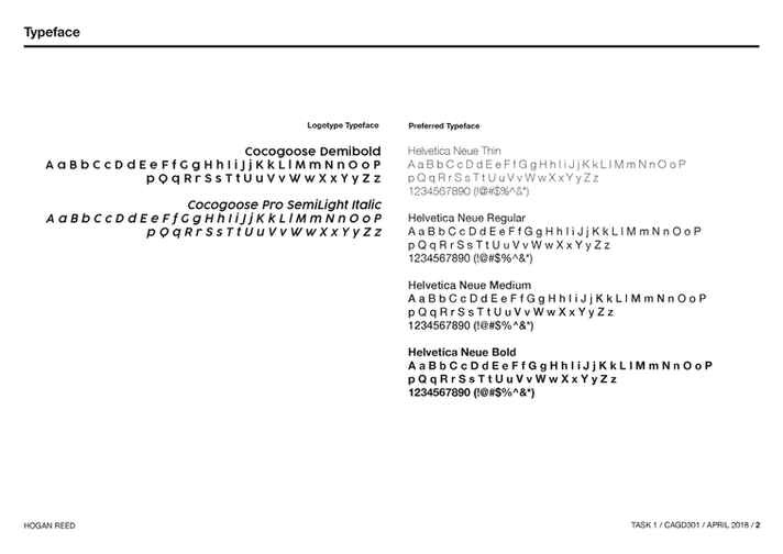
Typography
Color
As part of a senior-level course, I developed a brand identity for Untamed, a mountain biking tour company tailored specifically for women. This project showcases my creative process and design elements that capture the essence of adventure and empowerment.

Reflections
If I were to revisit this project, I’d reconsider the brand's typeface. While Helvetica offers clarity, it doesn’t fully capture the energy and personality of the company. Choosing a more expressive typeface, or designing a custom one, could better align with Untamed’s adventurous spirit.
I’d also expand the brand’s visual system by introducing elements like icons, symbols, or graphic patterns. These additions would strengthen recognition and create a more cohesive experience across all touchpoints.


